Editorial identity, concept project, Barcelona School of Creativity
View project
A little about me
I'm Núria, a graphic designer drawn to fashion and art direction.
I moved to Copenhagen almost three years ago, already half in love with it: a place where nothing exists by accident, where restraint still gets to be bold. That care shows up everywhere here, in the brands and in the way people simply live: unhurried, deliberate, quietly well made. It's why I'm staying.
Now that Copenhagen feels like home, I'm ready to design again, properly, and open to where that takes me.
A wardrobe stripped back to what matters: versatile, elegant, and quietly bold.
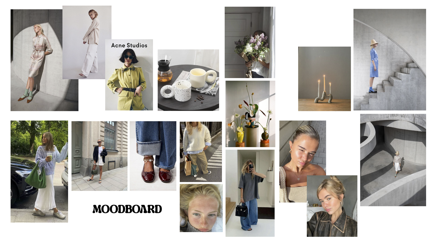
My roleArt direction. Research, concept, moodboard, casting and styling direction, shot-by-shot shooting plan.
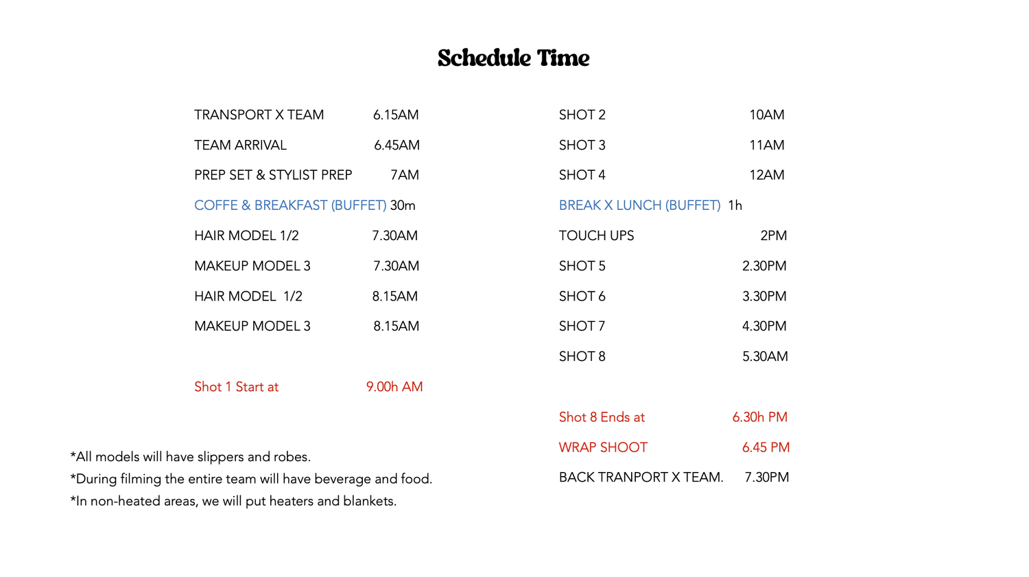
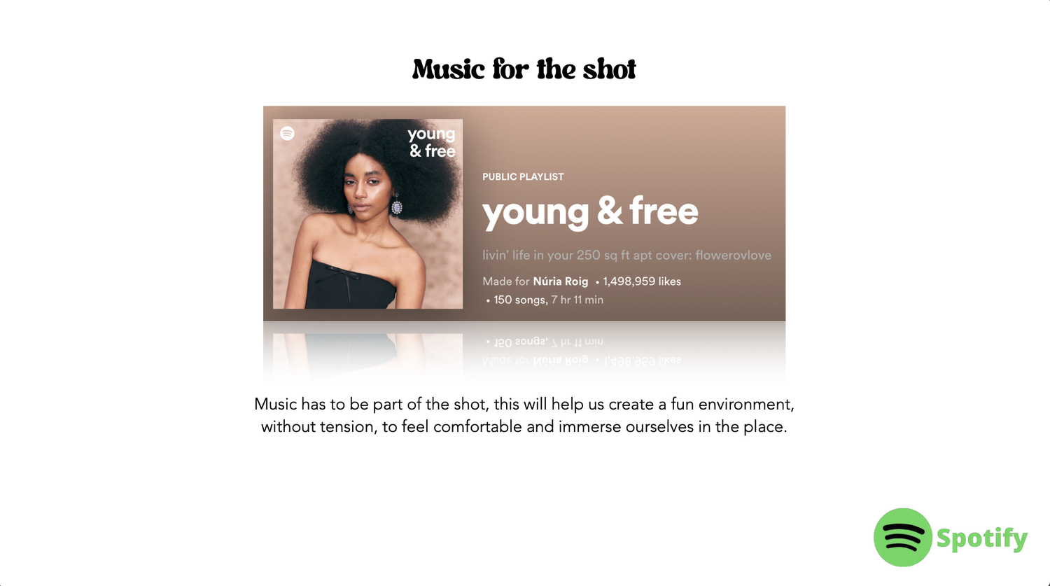
The brief: A Central Saint Martins project to art direct a fashion editorial for Schön!, a capsule built on fewer pieces and more intention.
The idea: Restraint as the statement, neutral tailoring and cherry-red accents inside the stone arches of Espai Corberó.
The craft: A full art direction package, from trend research and moodboard to a shot-by-shot shooting plan.
Design test, Change Lingerie
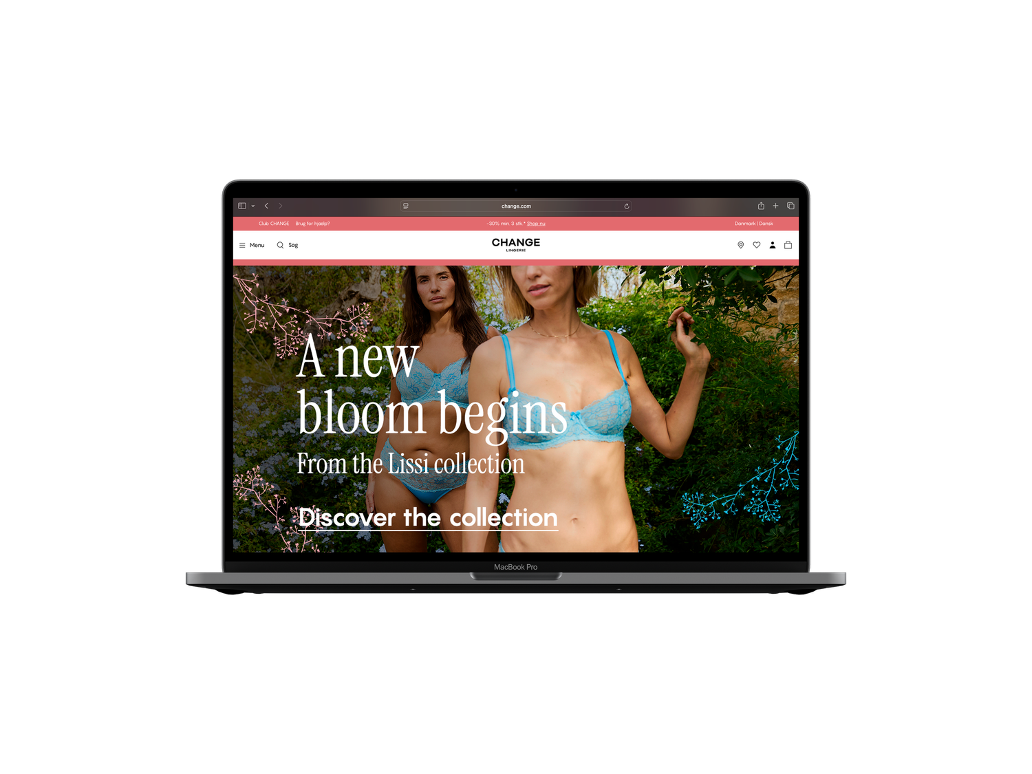
Lissi Bloom
A campaign that doesn't just show the collection: it invites you into it.
My roleArt direction and graphic design. One visual system carried across editorial email, homepage banner and in-store window poster.
The brief: A design test for Change Lingerie: introduce the Lissi Bloom collection across an editorial email, a homepage banner, and an in-store window poster.
The idea: Soft, but never quiet, delicate floral lines thread through every piece, turning three assets into one continuous story.
The craft: One cohesive system across email, web and print: Instrument Serif, a soft romantic palette, and floral detailing as connective tissue.
Palette
#EC6579
#70C1ED
#F4F1EA
#1A1A1A
Instrument Serif
a b c d e f g h i j k l m n ñ o p q r s t v w x y z A B C D E F G H I J K L M N Ñ O P Q R S T V W X Y Z 0 1 2 3 4 5 6 7 8 9
Pangram
a b c d e f g h i j k l m n ñ o p q r s t v w x y z A B C D E F G H I J K L M N Ñ O P Q R S T V W X Y Z 0 1 2 3 4 5 6 7 8 9
Homepage & In-store
Concept, Barcelona School of Creativity
Concept project, fictional brief
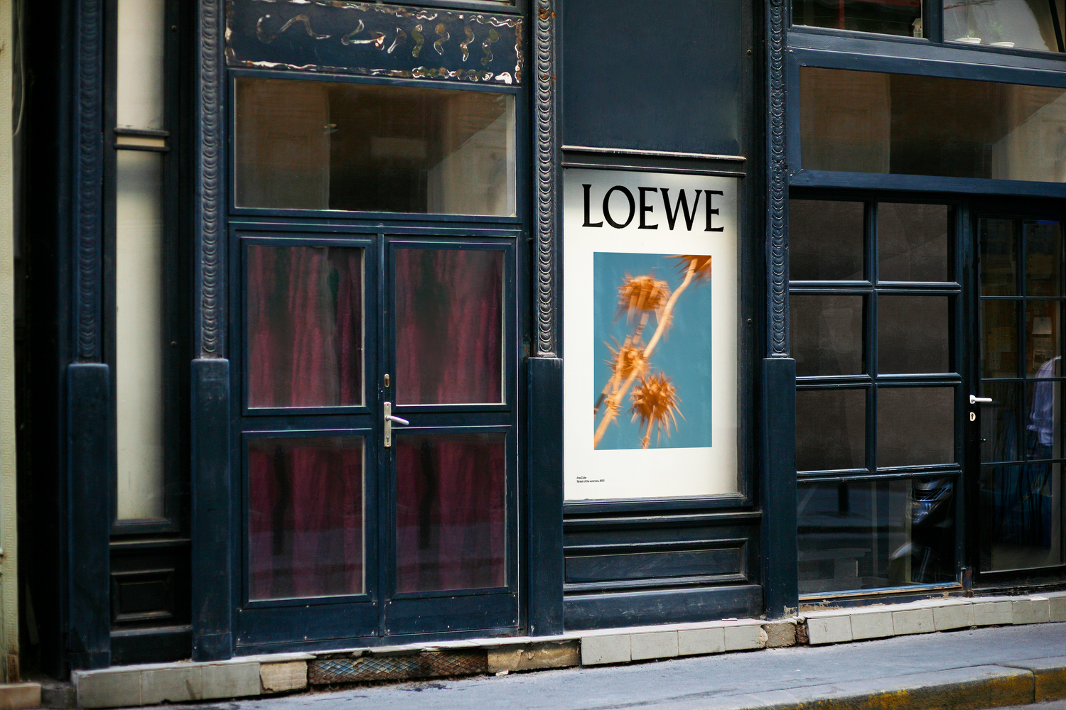
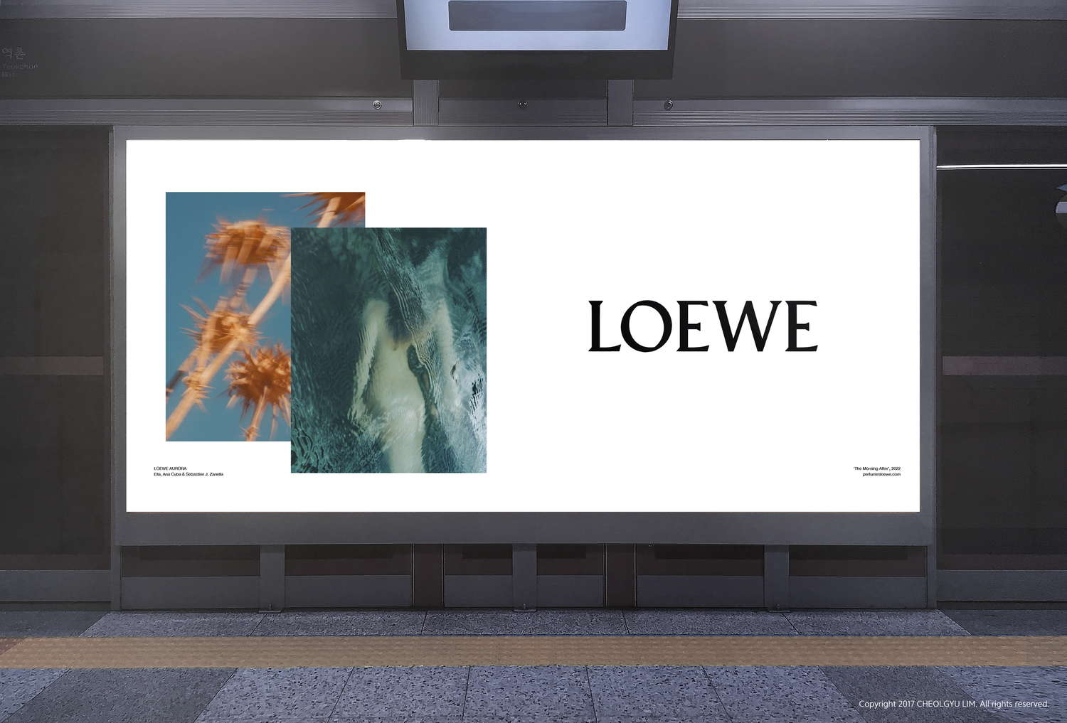
Loewe Aurora
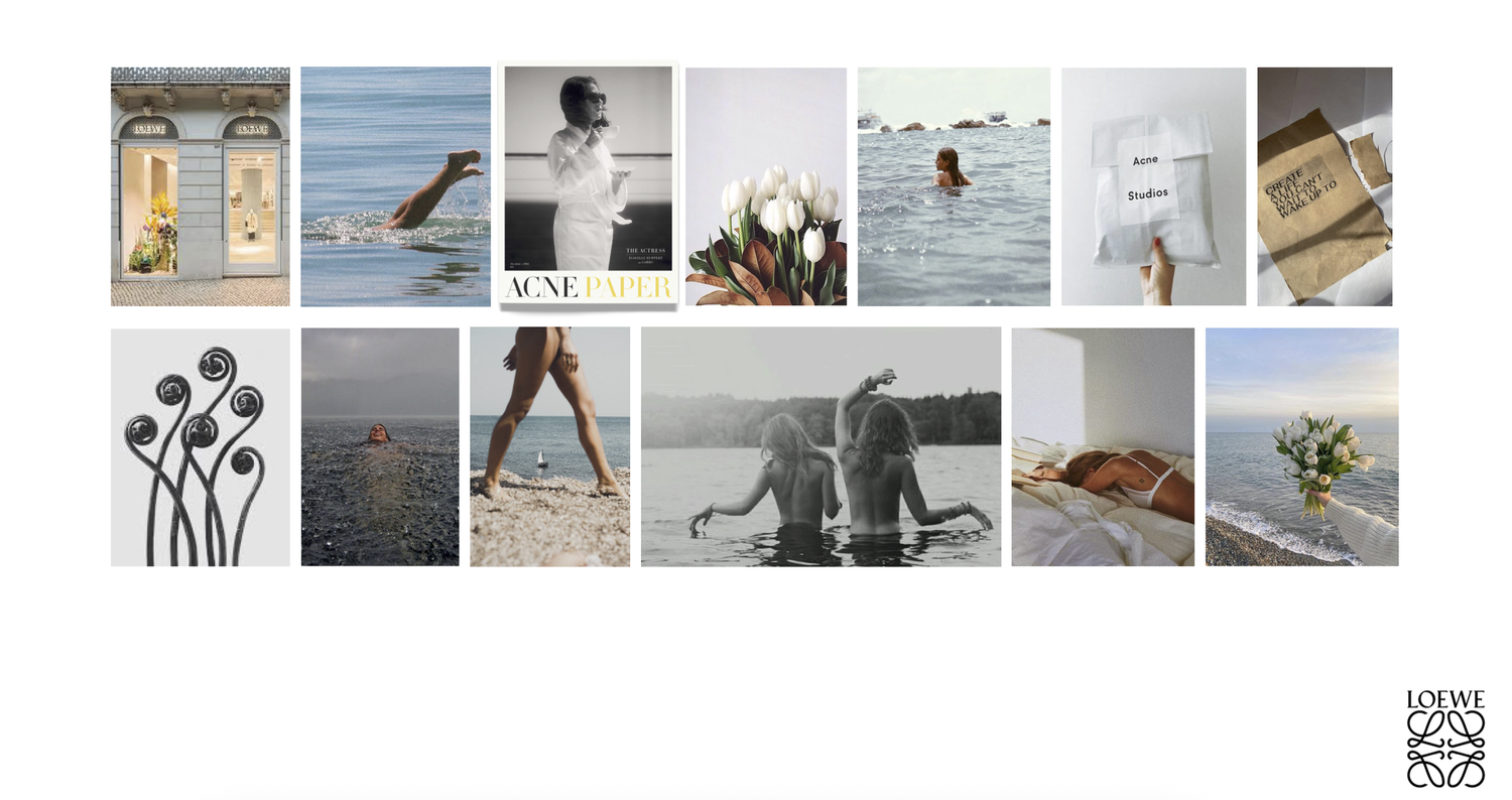
The morning after a summer night: that first rose-coloured light, bottled.
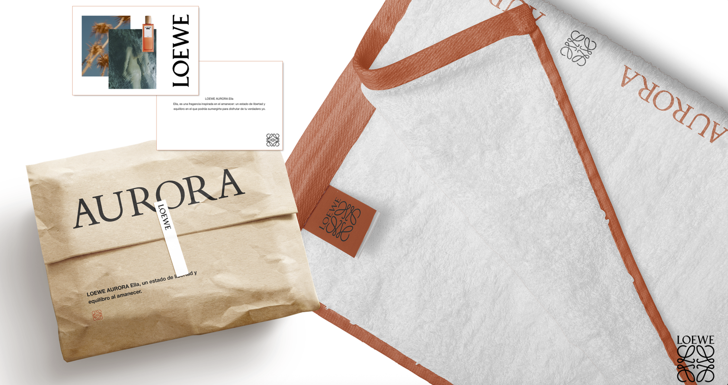
My roleArt direction and branding. Logo, colour and packaging design, plus the full campaign rollout from bottle to billboard.
The brief: A concept campaign for Aurora, a fictional Loewe fragrance, built on the reddish light just before sunrise.
The idea: Warm terracotta, pale morning blue and dried thistle, letting the fragrance whisper rather than shout.
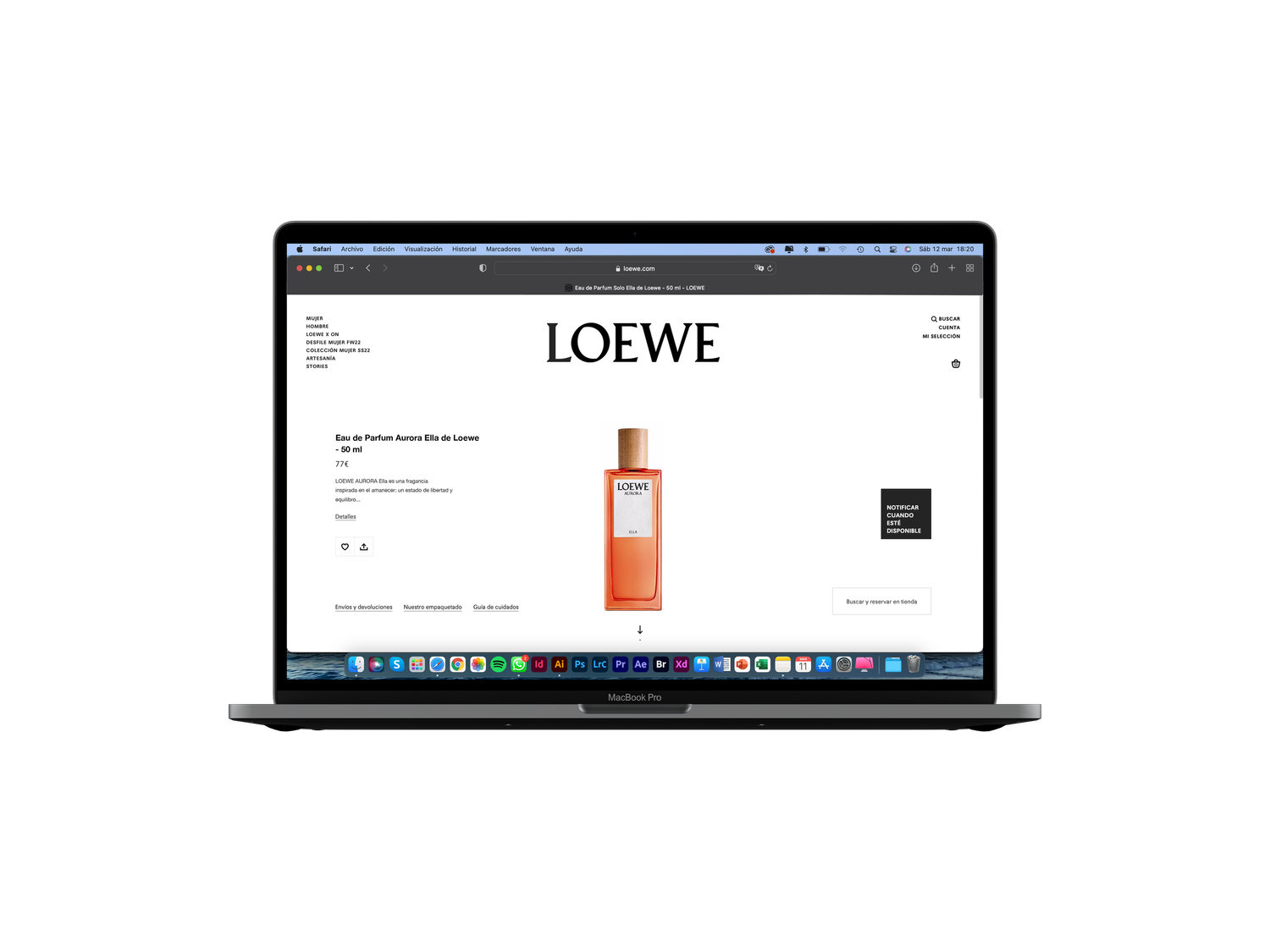
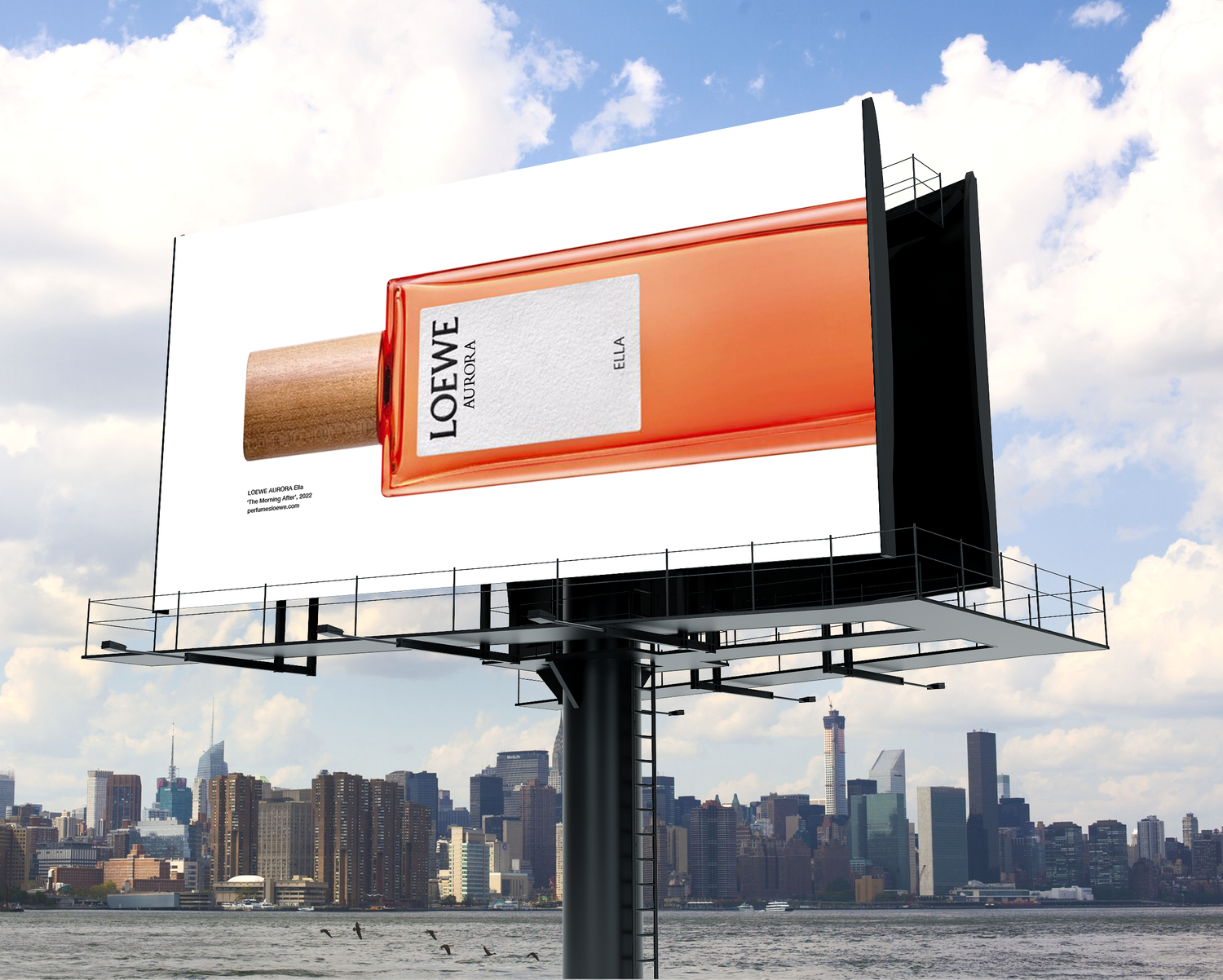
The craft: A full rollout, packaging to billboard, carrying one atmosphere from the bottle to the street.
Moodboard
Packaging
Applications
Editorial, Barcelona School of Creativity
Personal project
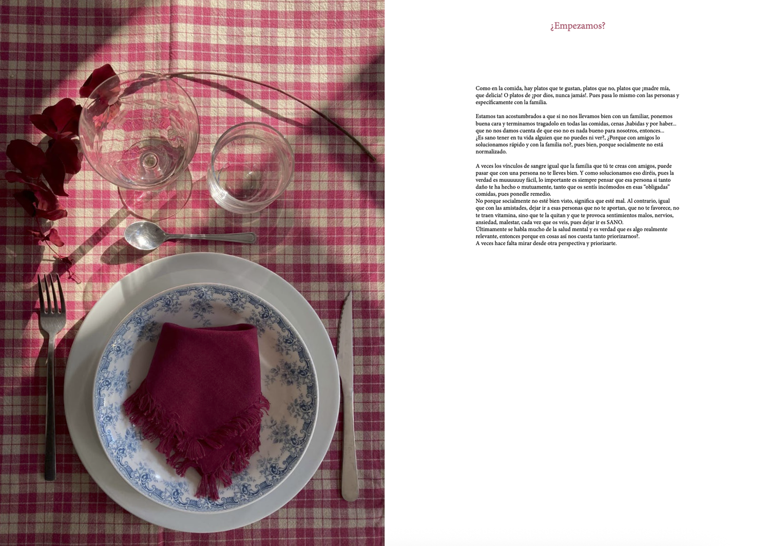
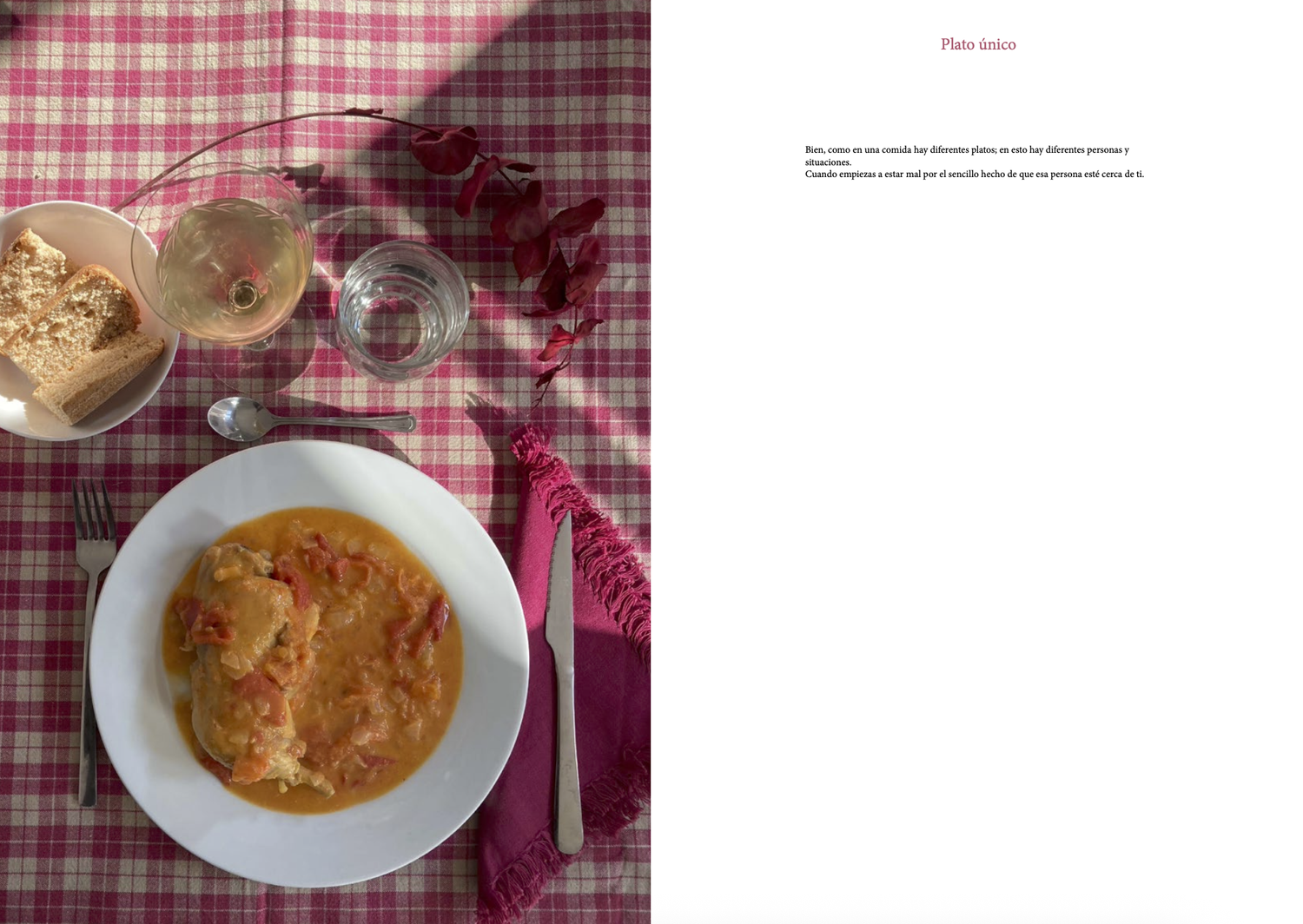
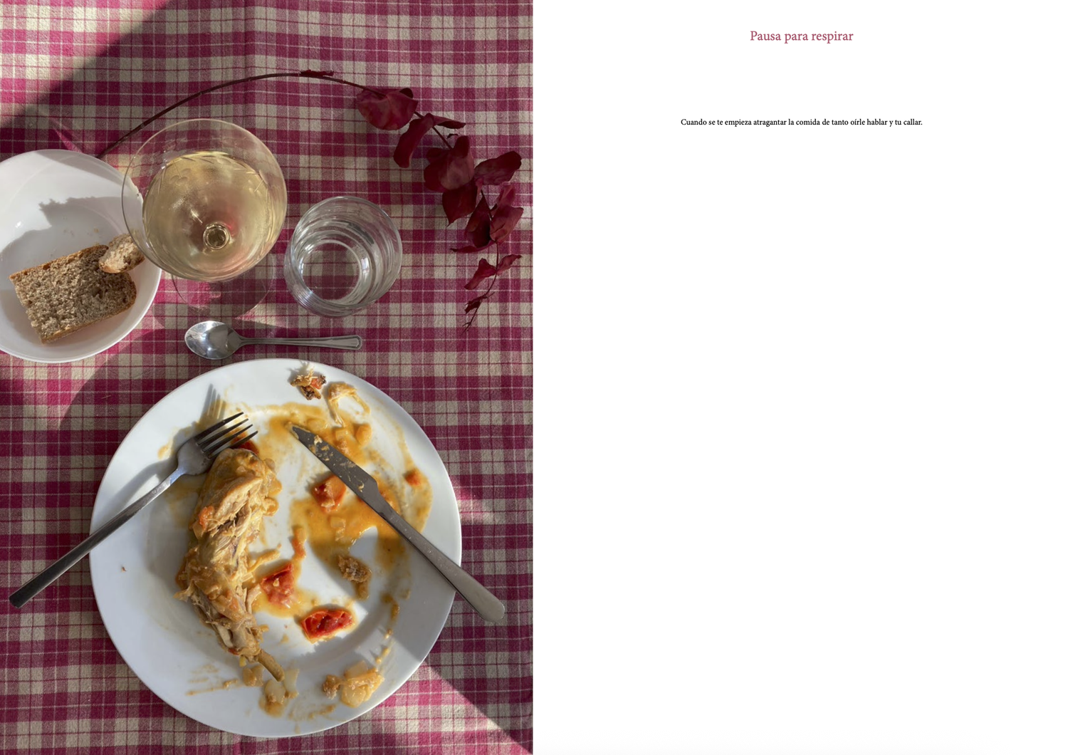
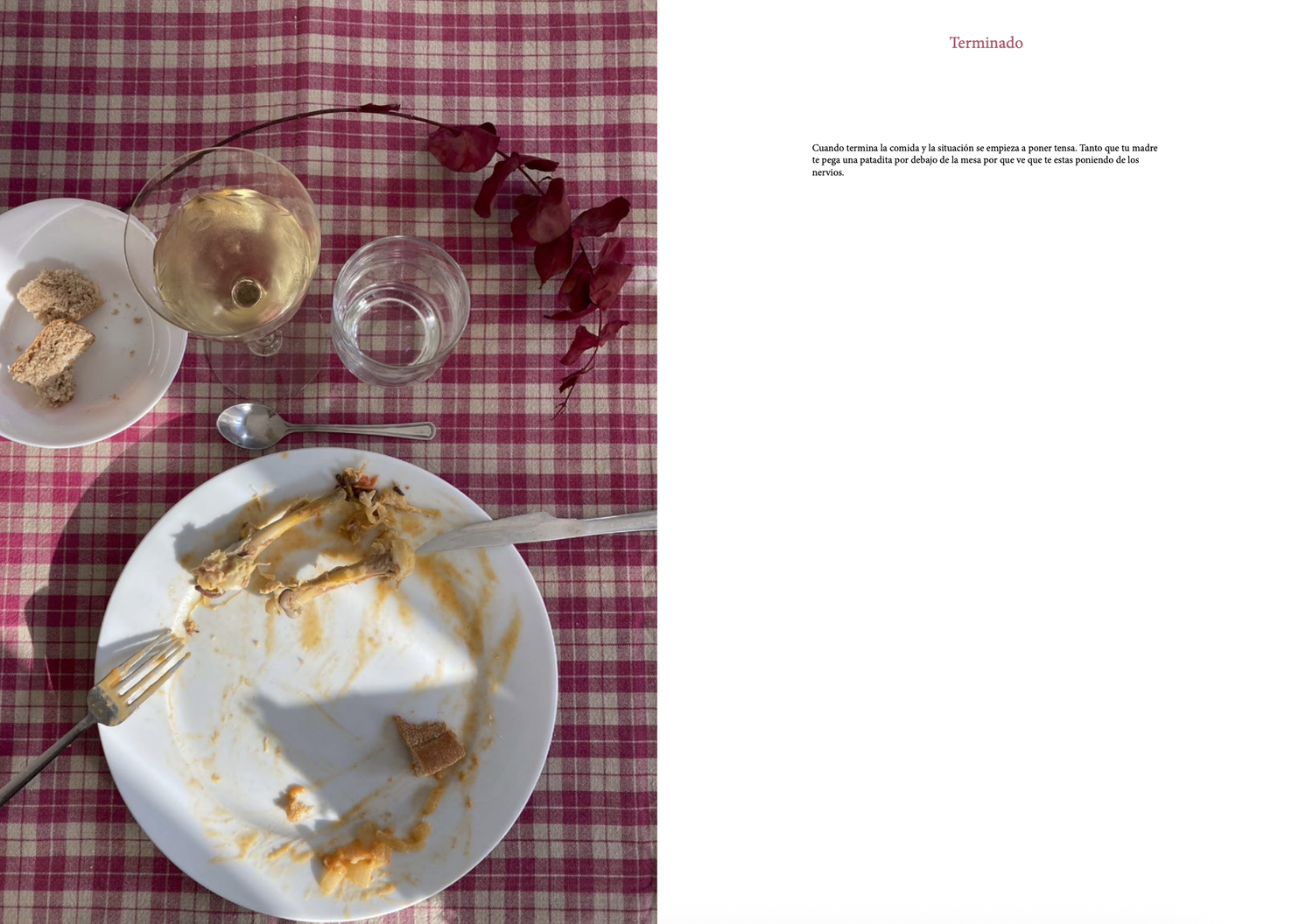
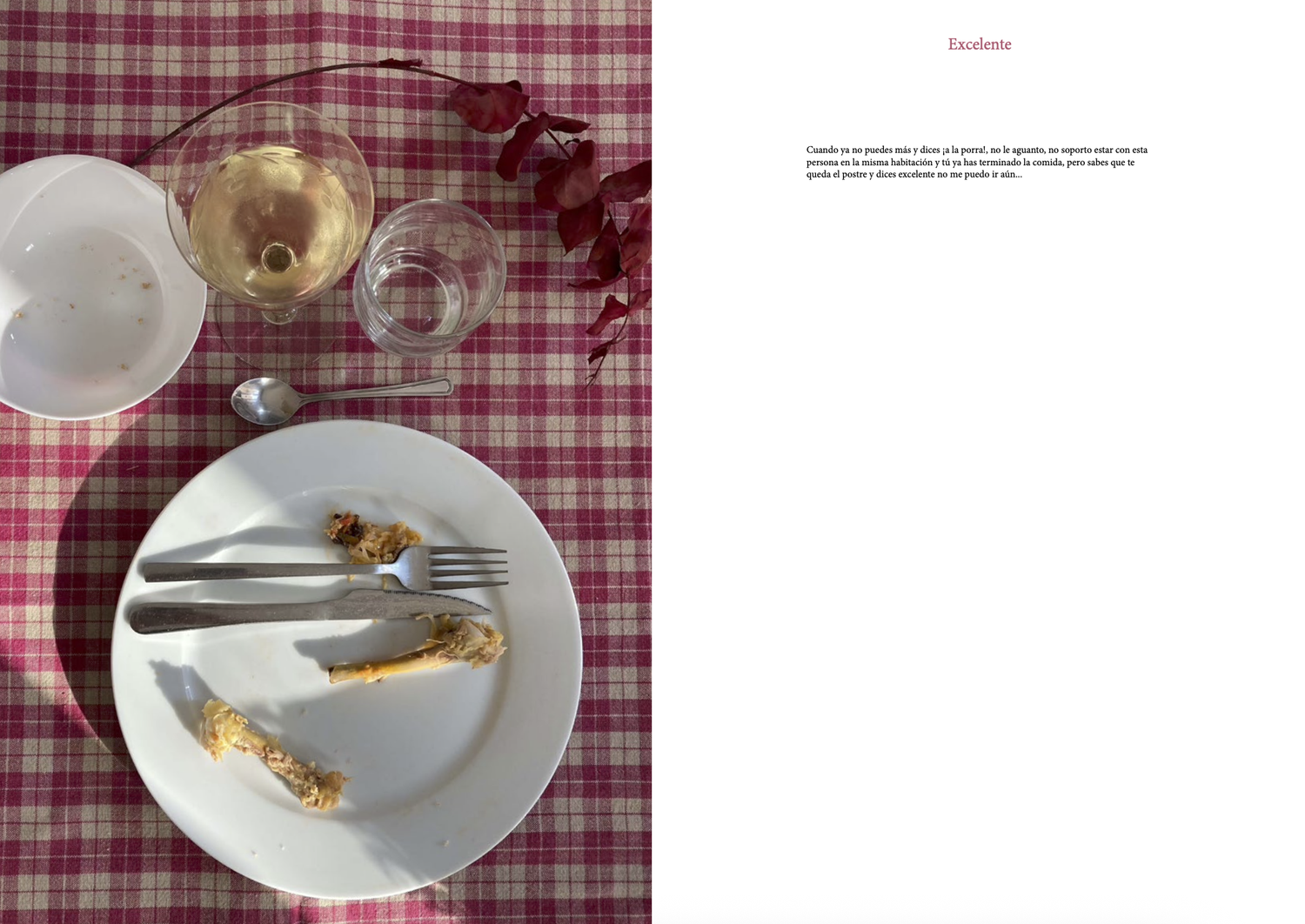
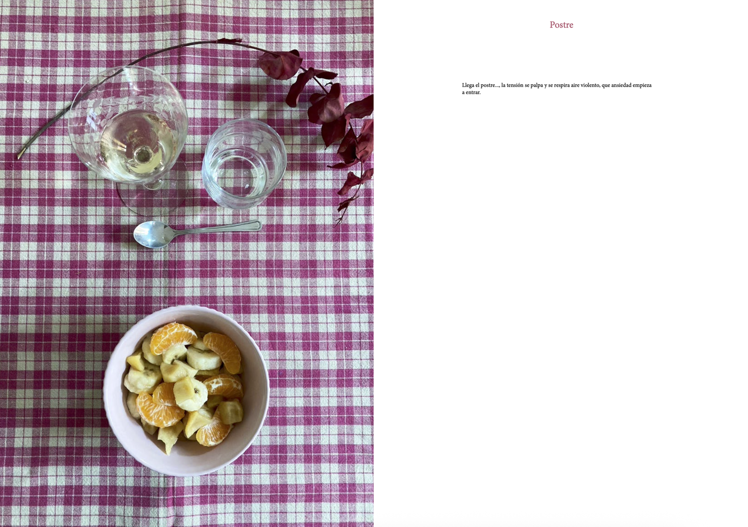
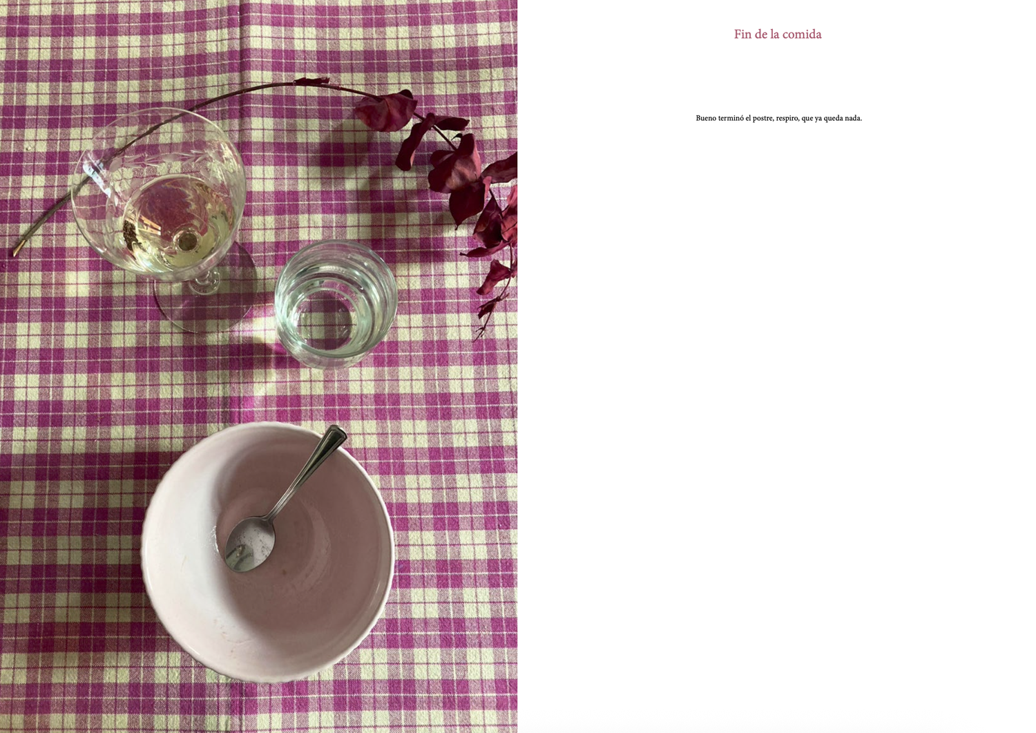
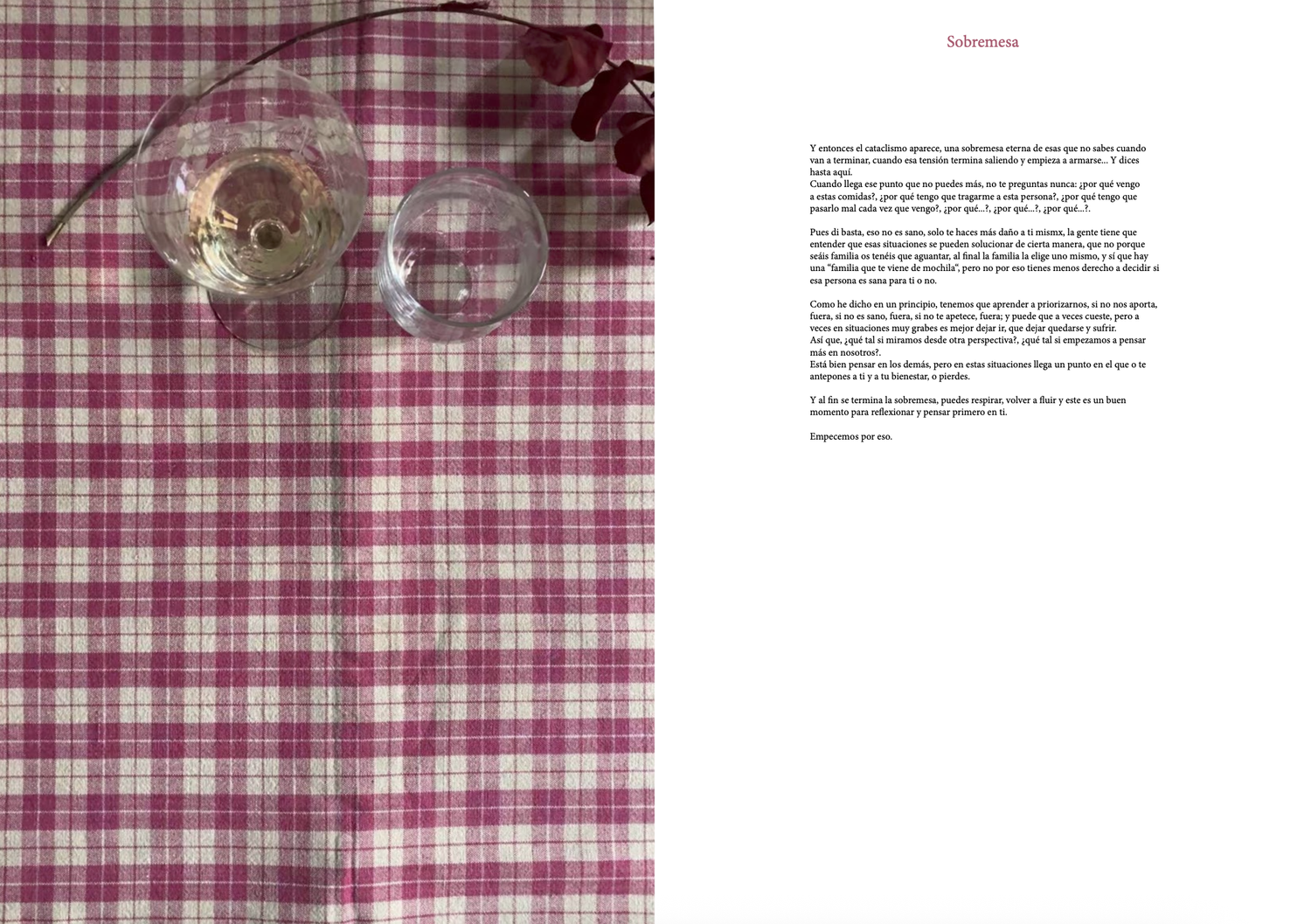
I Can't Stand You Anymore
Sometimes the healthiest thing is to get up from the table.
My roleConcept, editorial design and art direction. Narrative structure, photography direction and food styling, layout and print production.
The brief: An object book about learning to let go of the relationships that drain you, even the ones you're "supposed" to keep.
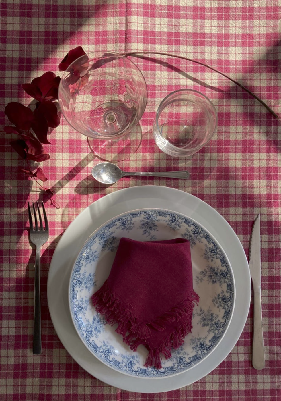
The idea: Built around a single meal, from the first bite to the sobremesa you can't wait to leave, the table becomes the metaphor: you can always choose to get up.
The craft: Editorial book design where image carries the emotion, a classic serif and styled food photography paced like courses in a meal.
Concept, Barcelona School of Creativity
Concept project, fictional brief
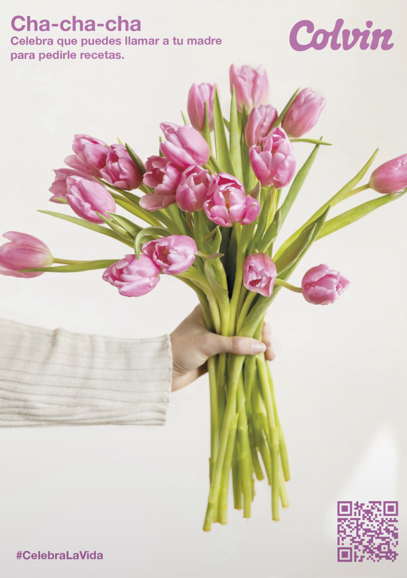
Colvin
Why wait for a special occasion? These bouquets are for celebrating the everyday.
My roleConcept, art direction and copywriting. Bouquet naming, poster series and the visual system behind it.
The brief: An advertising campaign for Colvin, challenging the idea that flowers are only for big moments.
The idea: Each bouquet gets its own name and its own tiny occasion, from calling your mum for a recipe to surviving a Tuesday.
The craft: A poster series on a clear system: consistent naming, a warm mauve accent, and QR codes from street to shop.
Editorial identity, concept project, Barcelona School of Creativity
Concept project, fictional brief
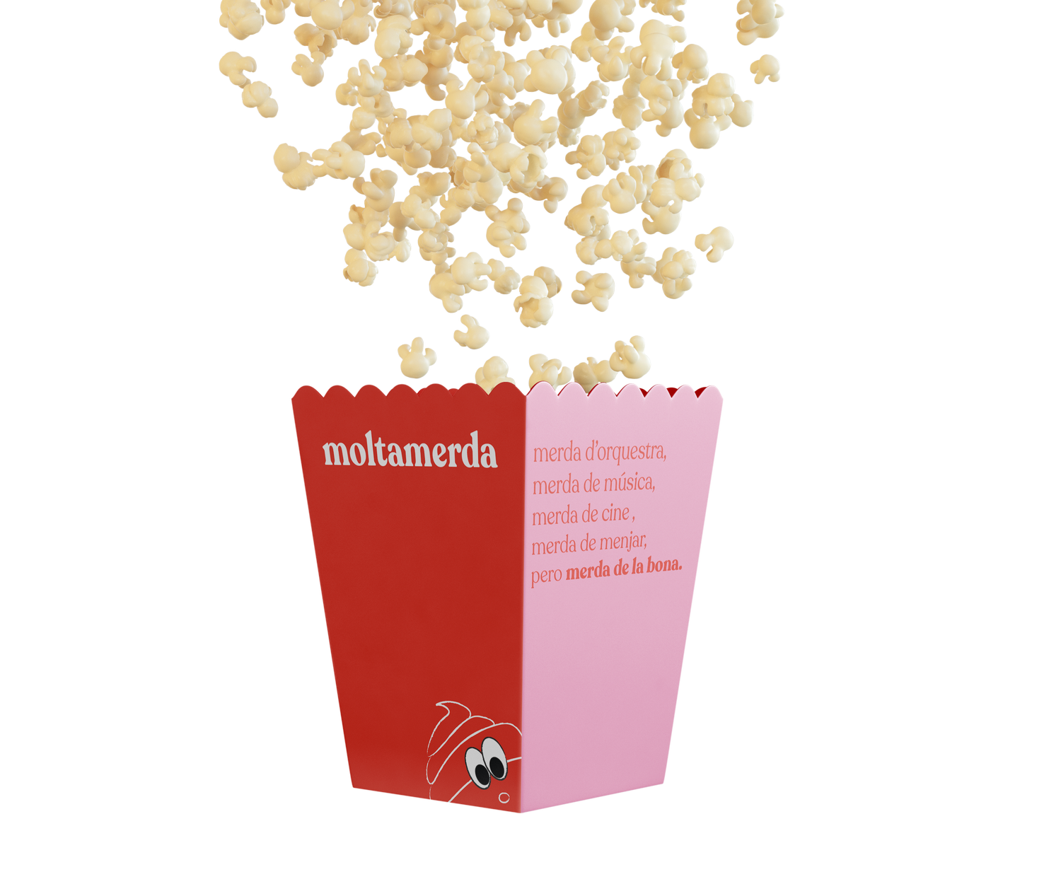
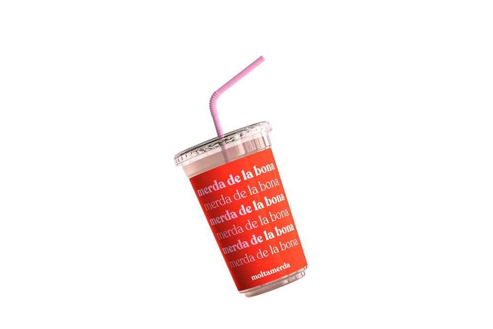
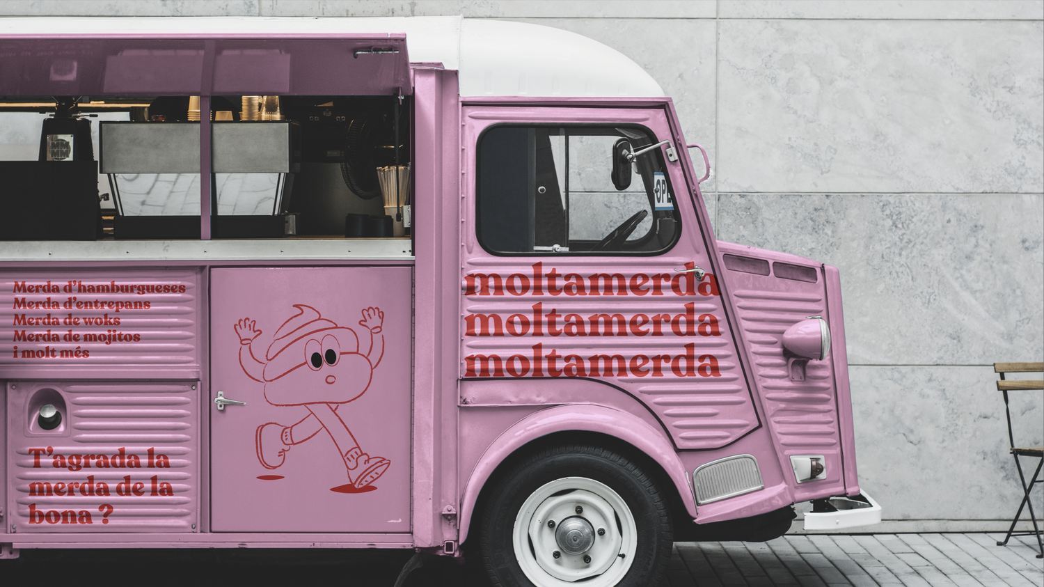
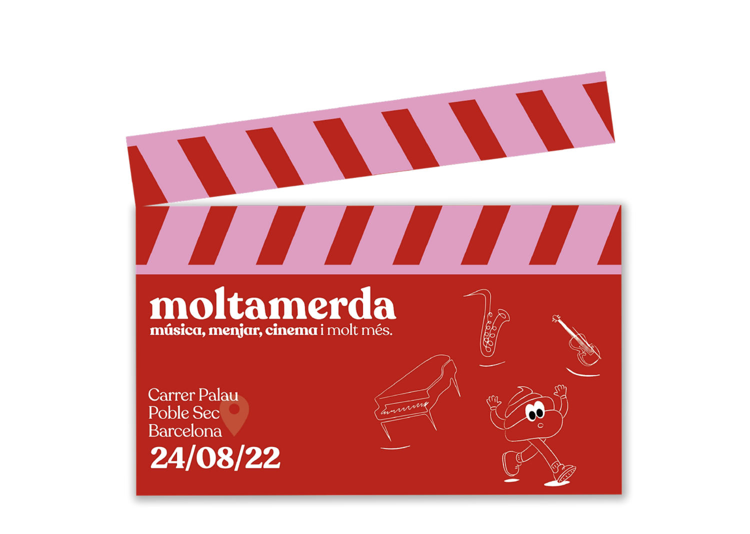
Moltamerda
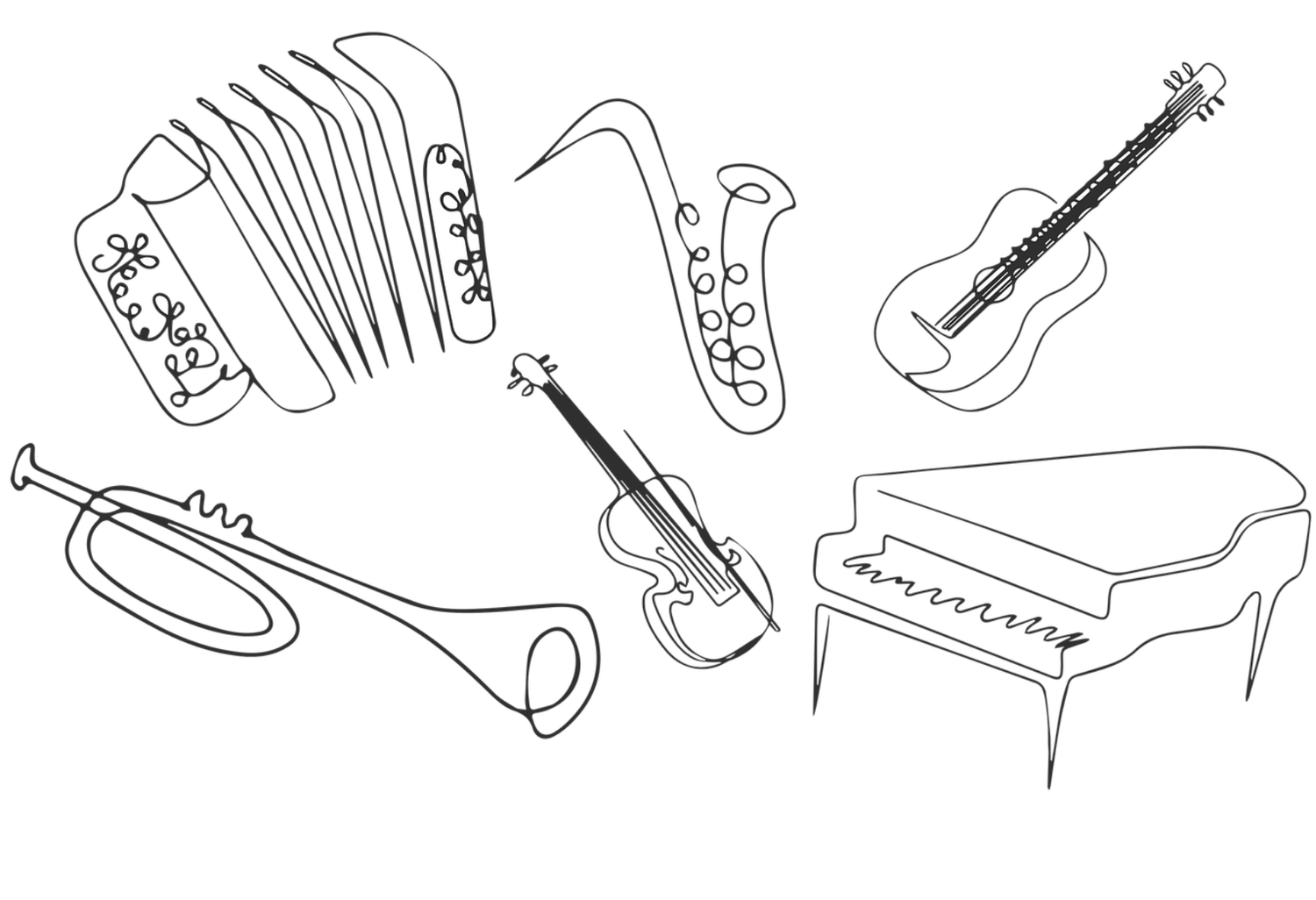
A cultural space built on cinema, live music and irreverent Catalan humour. No filmmaker, however famous, is safe from the jokes.
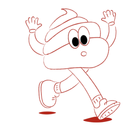
My roleBrand identity and art direction. Naming, tone of voice, illustration, and the full application system across print, packaging, merchandise and digital.
Illustration
The brief: A concept identity for a cultural space that goes beyond the open-air cinema. Screenings are paired with a live symphony orchestra, plus a leisure area built around film and music.
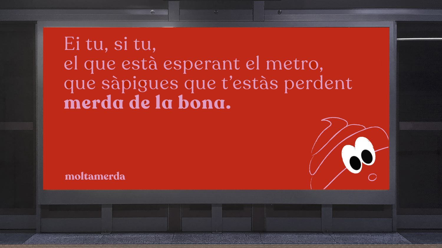
The idea: An irreverent editorial voice, borrowed from Catalan street culture, gives the brand its edge, needling the film world's biggest names through a disciplined two-colour, bold-serif system.
The craft: One typeface, one palette, applied with total consistency across posters, signage, packaging, merchandise and digital, a full brand system built and tested at scale rather than a single key visual.
Palette
#F29FC5
#D42200
#FFFFFF
Recoleta Bold
a b c d e f g h i j k l m n ñ o p q r s t v w x y z A B C D E F G H I J K L M N Ñ O P Q R S T V W X Y Z 0 1 2 3 4 5 6 7 8 9
Recoleta Light
a b c d e f g h i j k l m n ñ o p q r s t v w x y z A B C D E F G H I J K L M N Ñ O P Q R S T V W X Y Z 0 1 2 3 4 5 6 7 8 9
Posters
Applications
Beyond the screening room
Print & pattern design, Client work
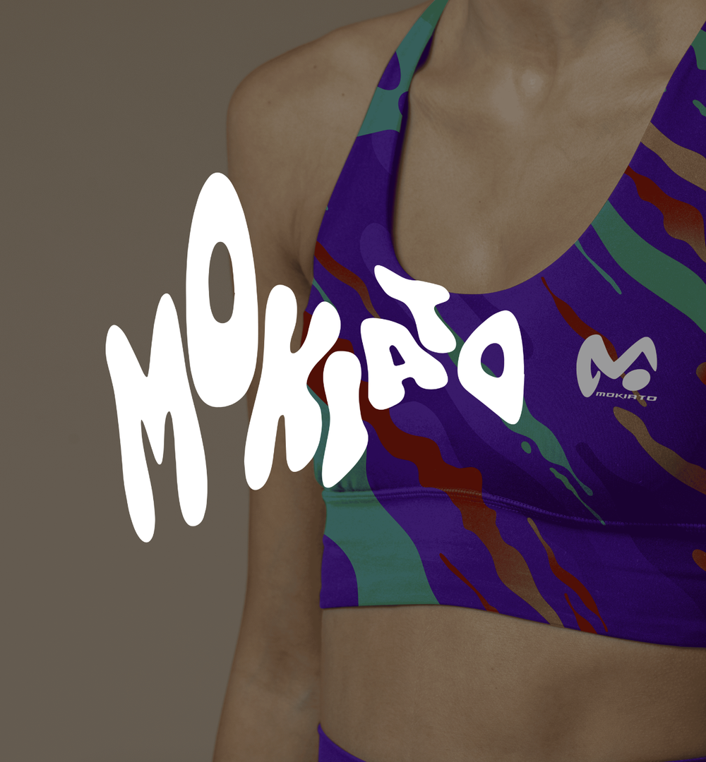
Mokiato Sports
Vibrant, high-energy prints made to stand out on the field, and actually produced.
My rolePrint and pattern design. Four repeatable prints designed for the Summer-Fall capsule, taken through to production and now on sale.
The brief: Prints and graphics for Mokiato Sports' Summer-Fall capsule, sportswear built to stand out through bold colour and pattern.
The idea: Four vivid, high-movement prints, Purple Explosion, Green Waves, Technology and Unicorn, each designed to feel like energy in motion.
The craft: Repeatable pattern work across the full range, tops to tees, designed and produced for real. See it live at mokiatosports.com.